
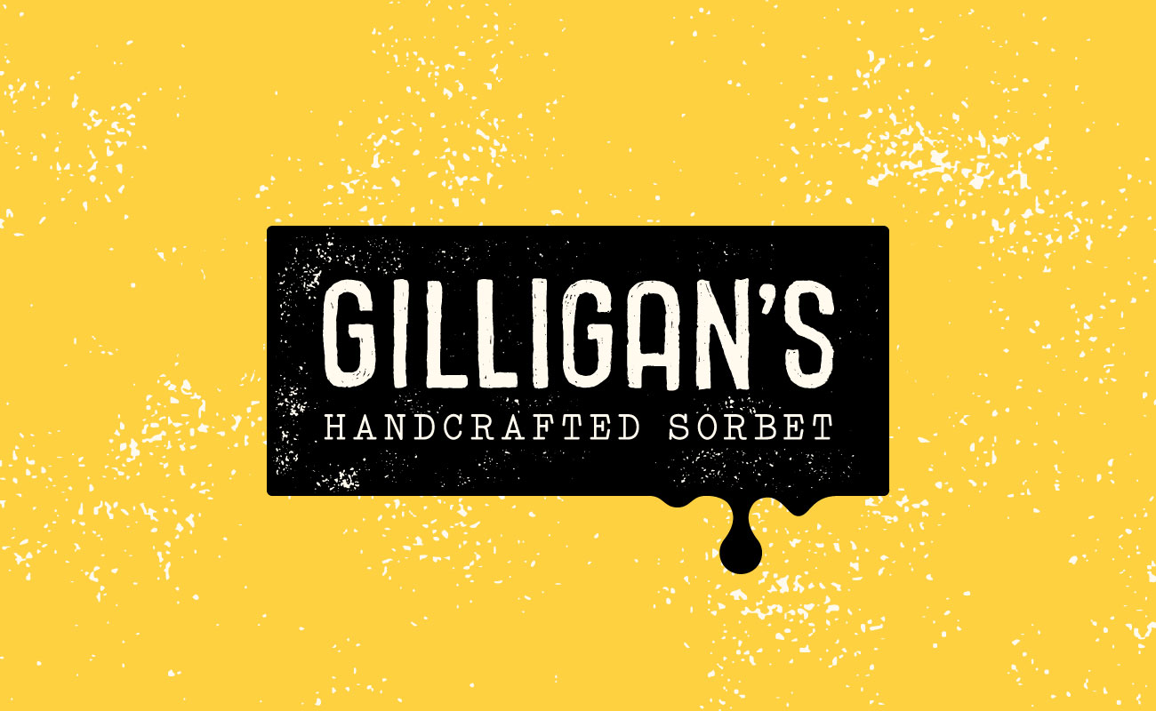

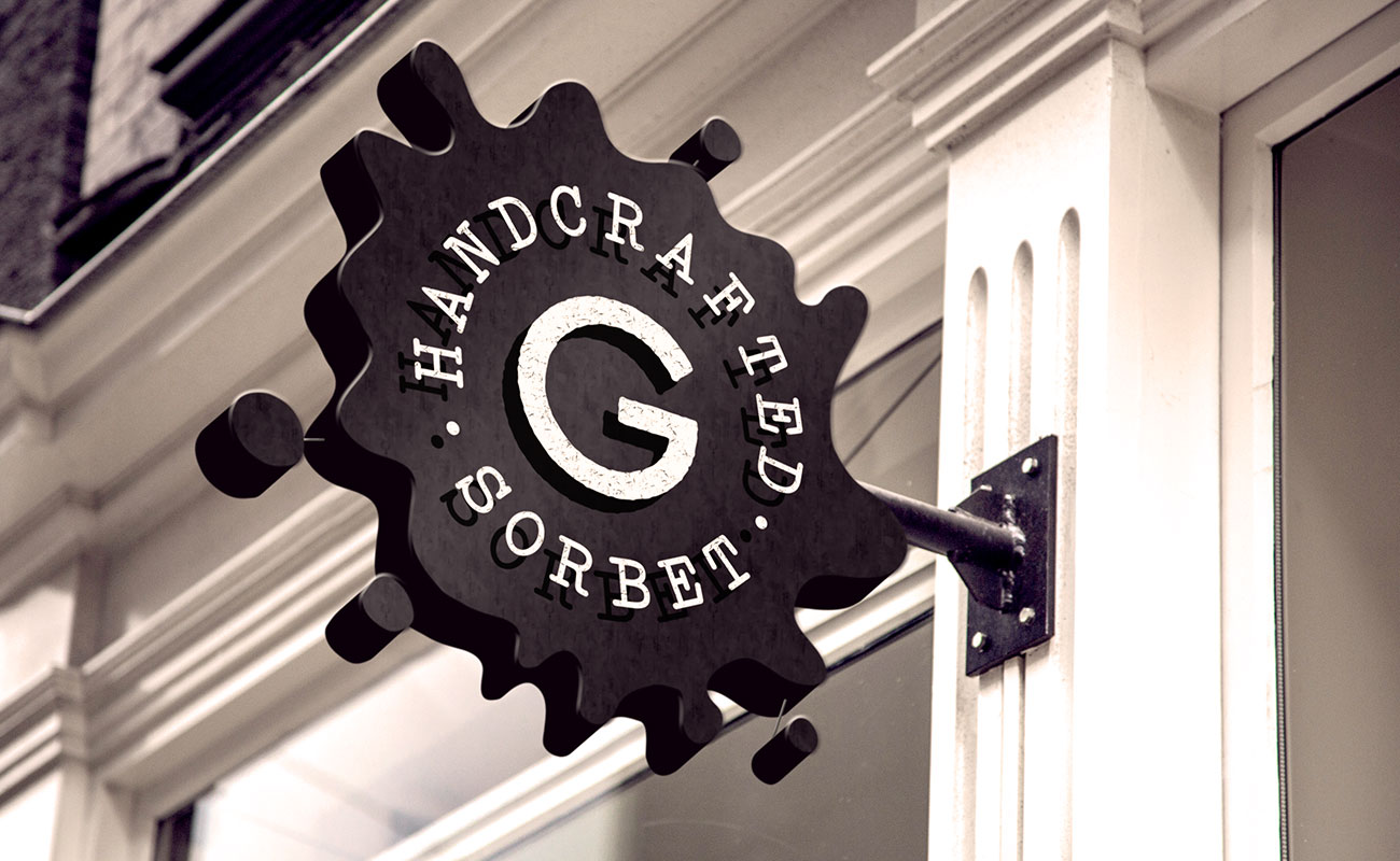
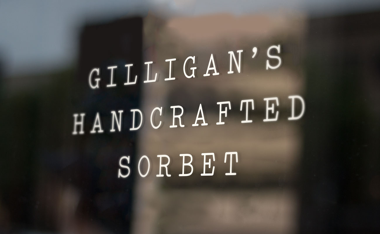
Gilligan's called for a logo that's as playful and frosty as their sorbet is. We used hand drawn type with textured splatters and drips to create a folksy series of marks that melt before your eyes. Secondary text takes a cue from the typewriter to evoke the brand's small batch appeal.


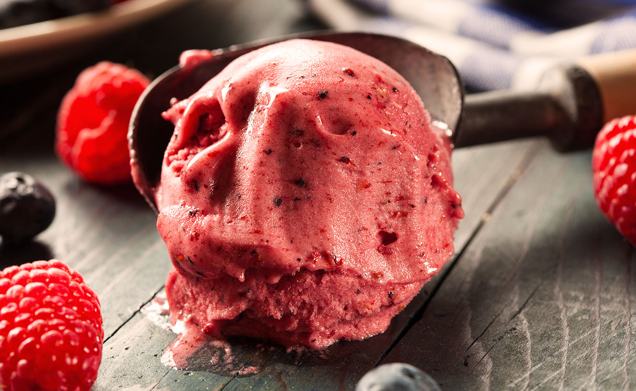
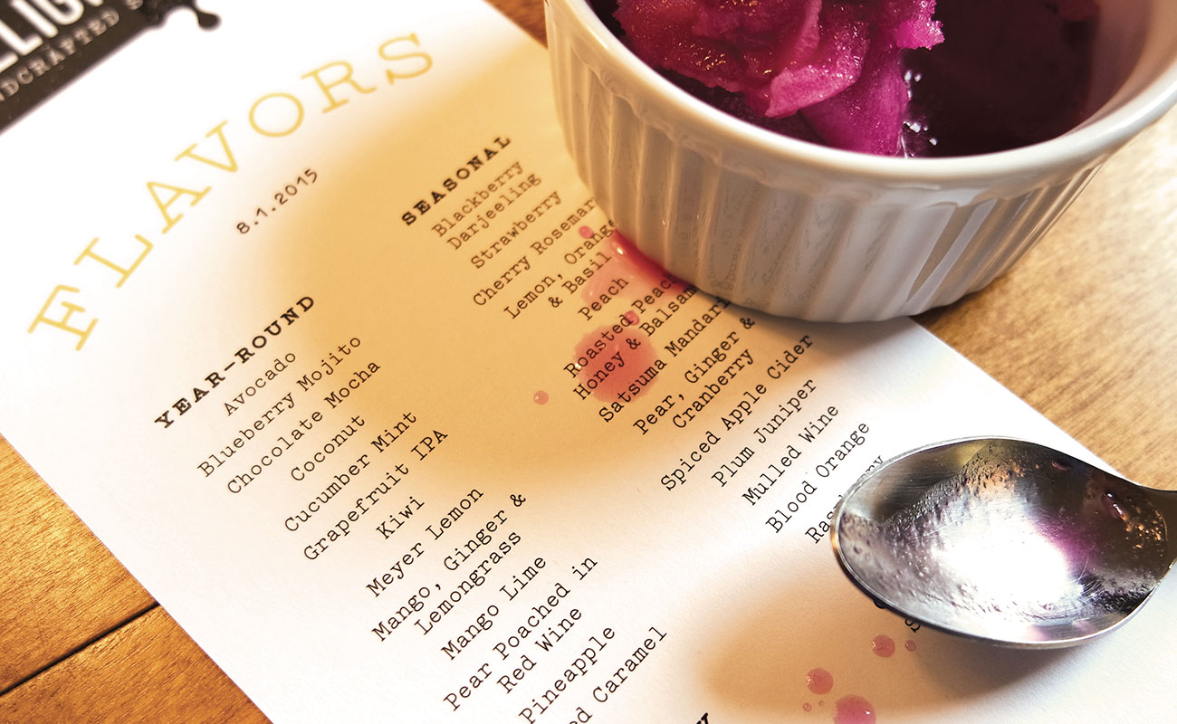
Flexible menus were needed to accommodate Gilligan’s ever-changing catalog of flavors. HH developed a series of straightforward, editable templates using two inks, keeping print costs down and reflecting the brand's natural simplicity. Vivid color accents extend to the brand's imagery and capture the beauty of fresh fruit.


The founder's inherited passion for gardening inspired further creative exploration. Graphics were based on a variety of gardening and agricultural tools, from watering can heads to produce scales, and by the seed patterns found when slicing a variety of fruit.


“We wanted the brand to feel fresh and detailed — and be approachable at the same time. It all comes through more than we ever expected.”


