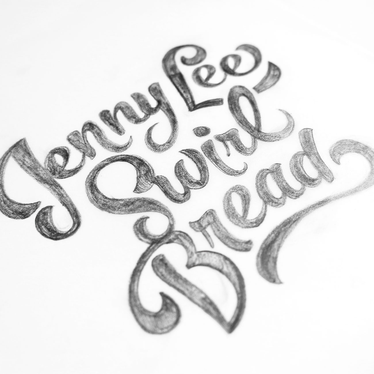
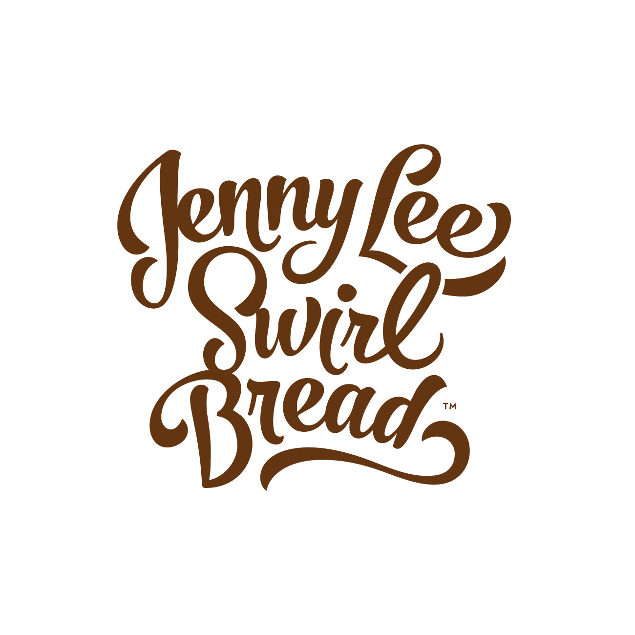
HH preserved Jenny Lee's original hand drawn script concept, but brought the mark into the 21st century. The forms were completely reworked to give them more presence and movement — suggestive of the bread’s rich cinnamon swirls — while simultaneously maintaining readability.
The new mark provided the anchor for a complete redesign of Jenny Lee's packaging. By using a simplified layout, generous white space and a restrained color palette, the brand is once again the hero. The new design also improved flavor recognition by stripping away unnecessary noise.
“It’s a fresh, uncluttered design. Consumers are drawn to the evolved brand, which remains true to our roots. ”


