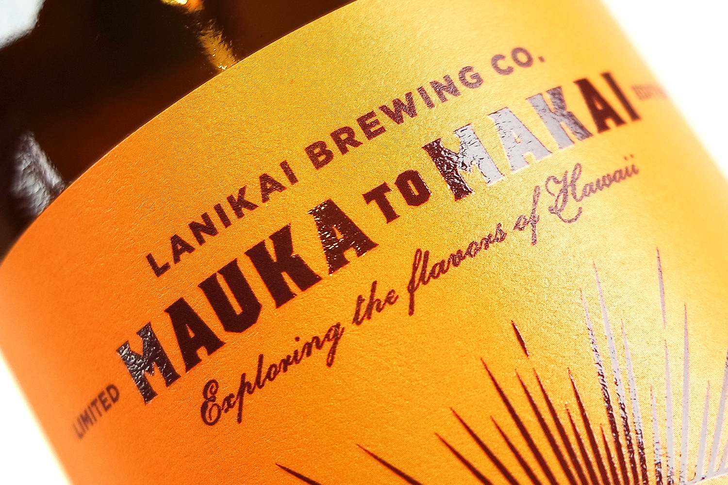

Mauka to Makai represents a new sub-brand for the brewery. In light of that, HH started by developing a unique wordmark that could position the series as a premium offering and support its higher price point. Secondary typefaces draw a familiar connection to the parent brand.

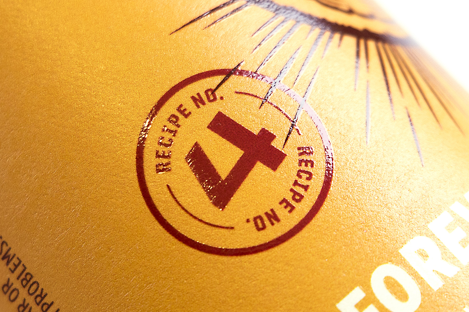
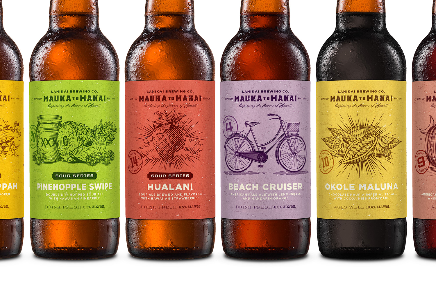
A simple, one-color woodcut illustration serves as the visual hero on each label and suggests the handcrafted nature of the beer within. This approach gave Lanikai an efficient, yet dynamic path to generating the designs they would need to release multiple beers each year.
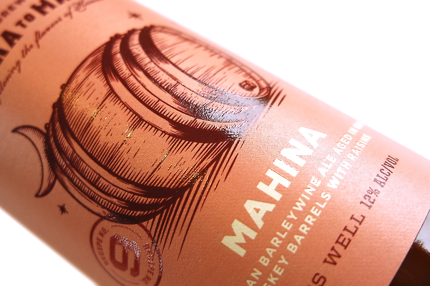
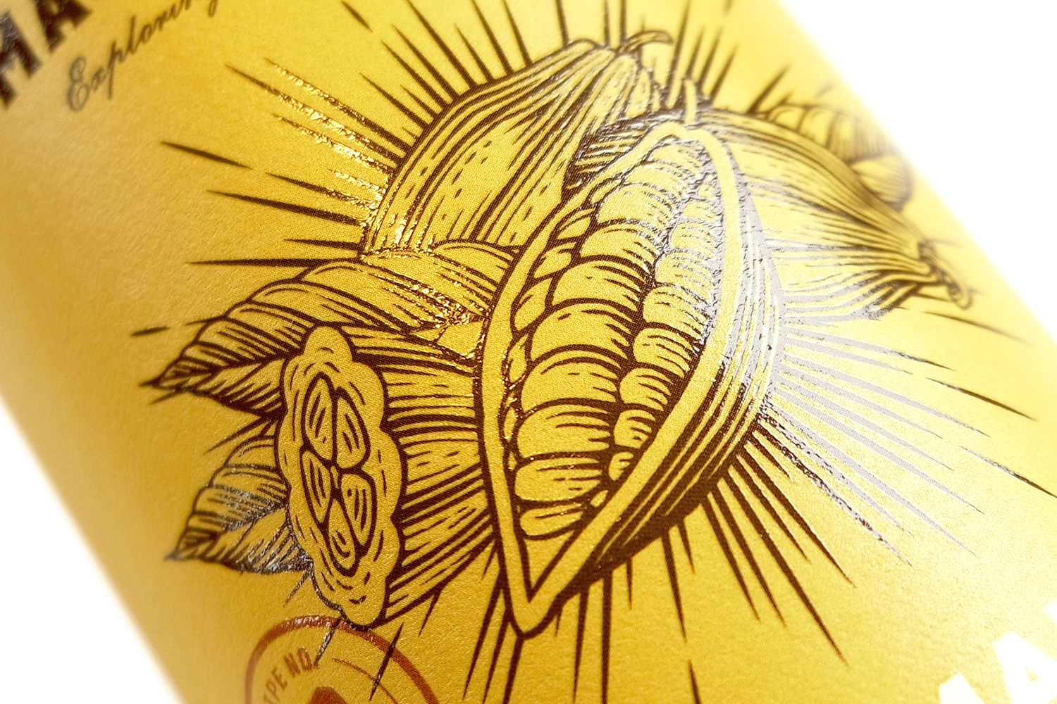
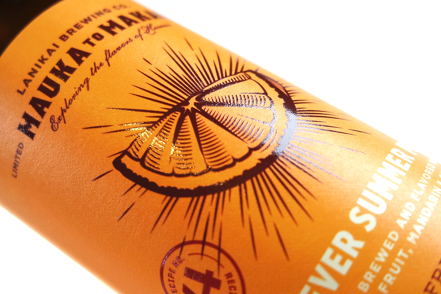
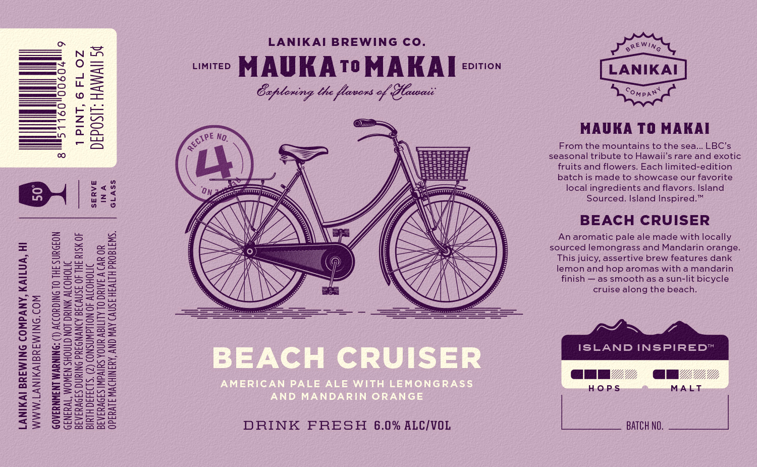
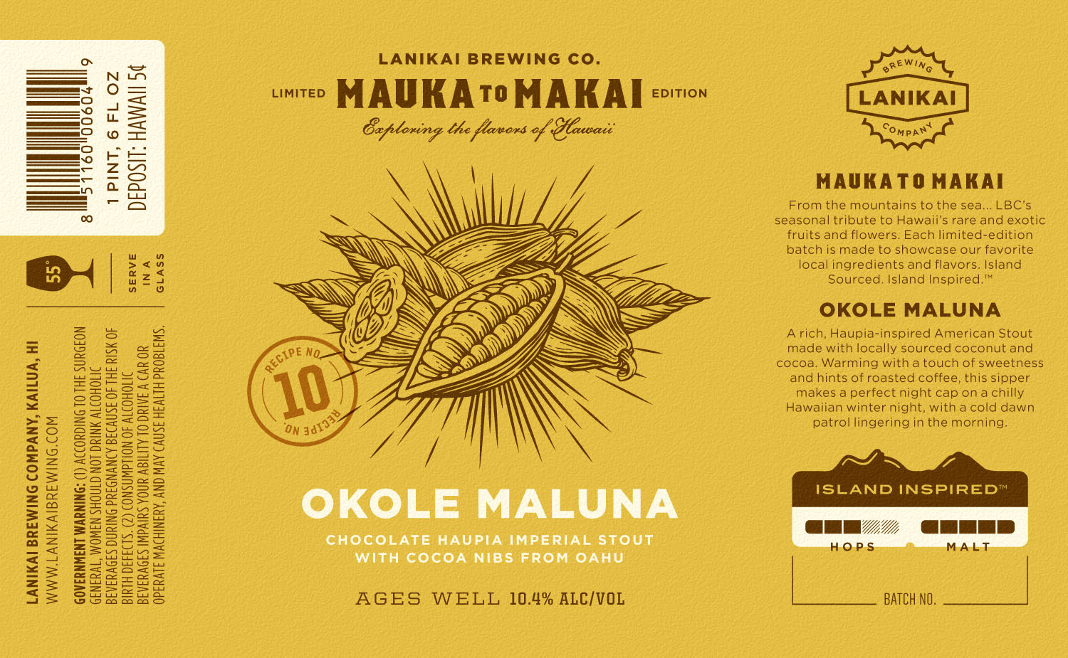
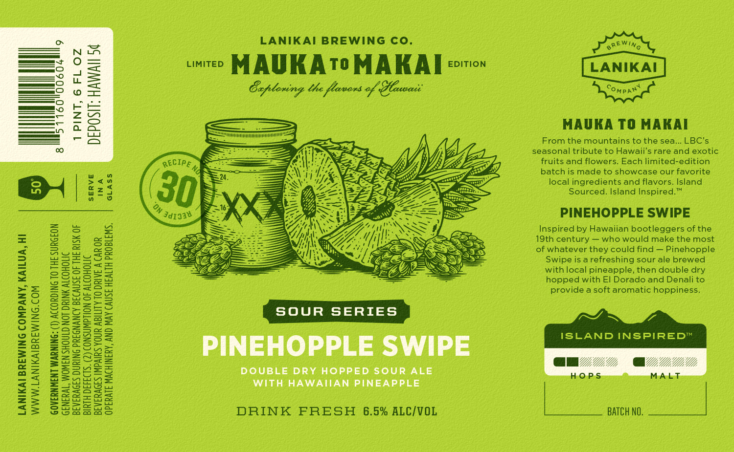
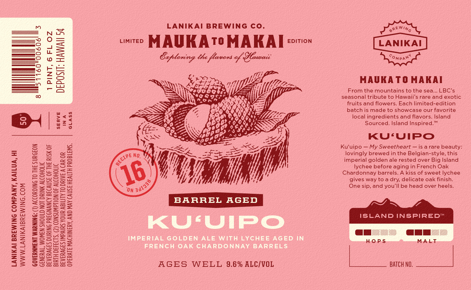
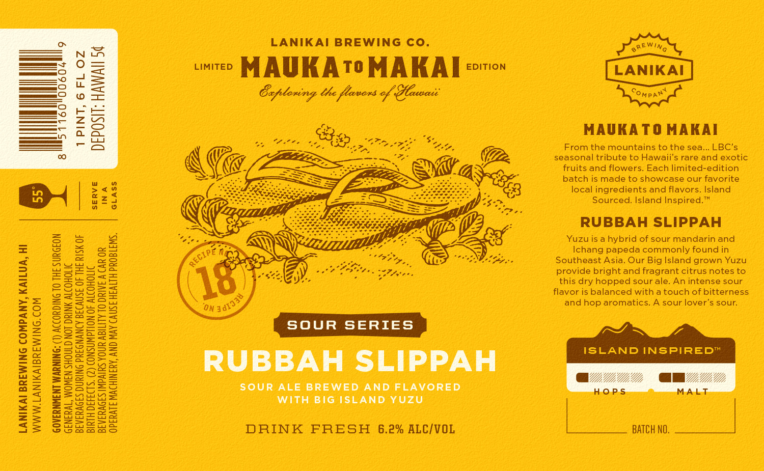
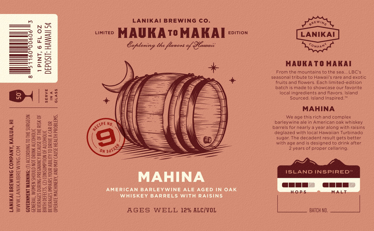
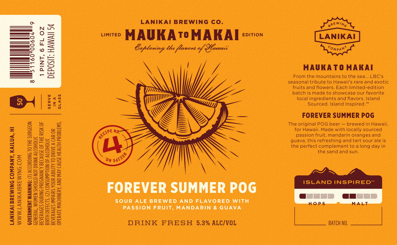
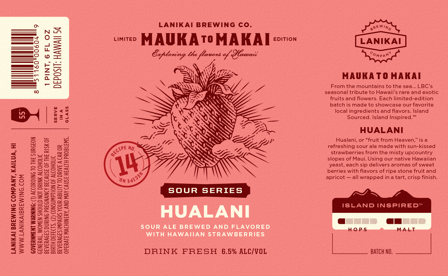
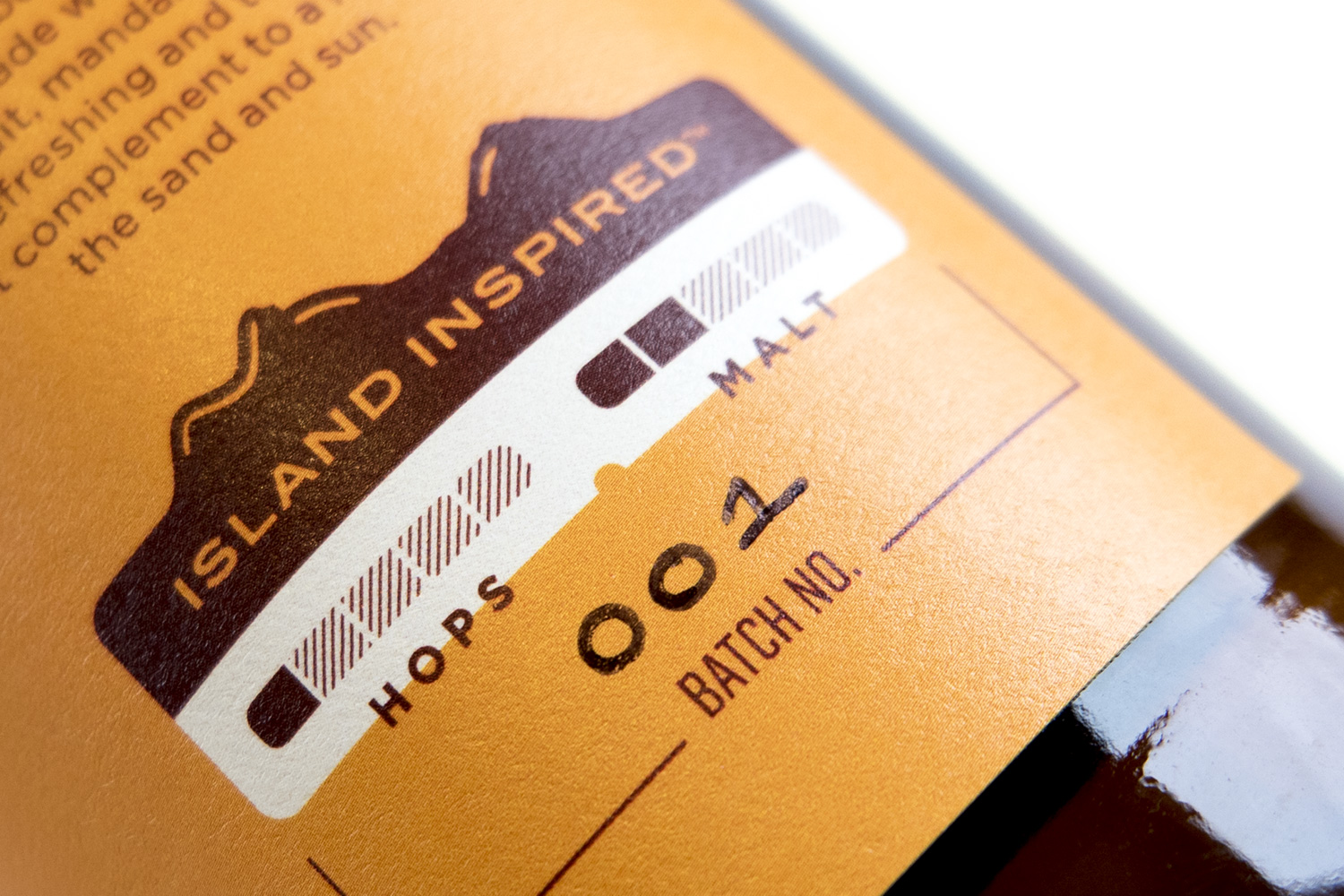
Vivid color floods are used to capture the brewery's Island Inspired™ personality and distinguish each individual release. Each label also features a unique recipe number, reinforcing the experimentation and variety found throughout the constantly evolving series.

“Another home run... the perfect carryover for the brand, with an exciting new look. ”
Steve Haumschild — CEO & Brewmaster, Lanikai Brewing Co.